[ WORKS · WEBSITE ]
Skalatama
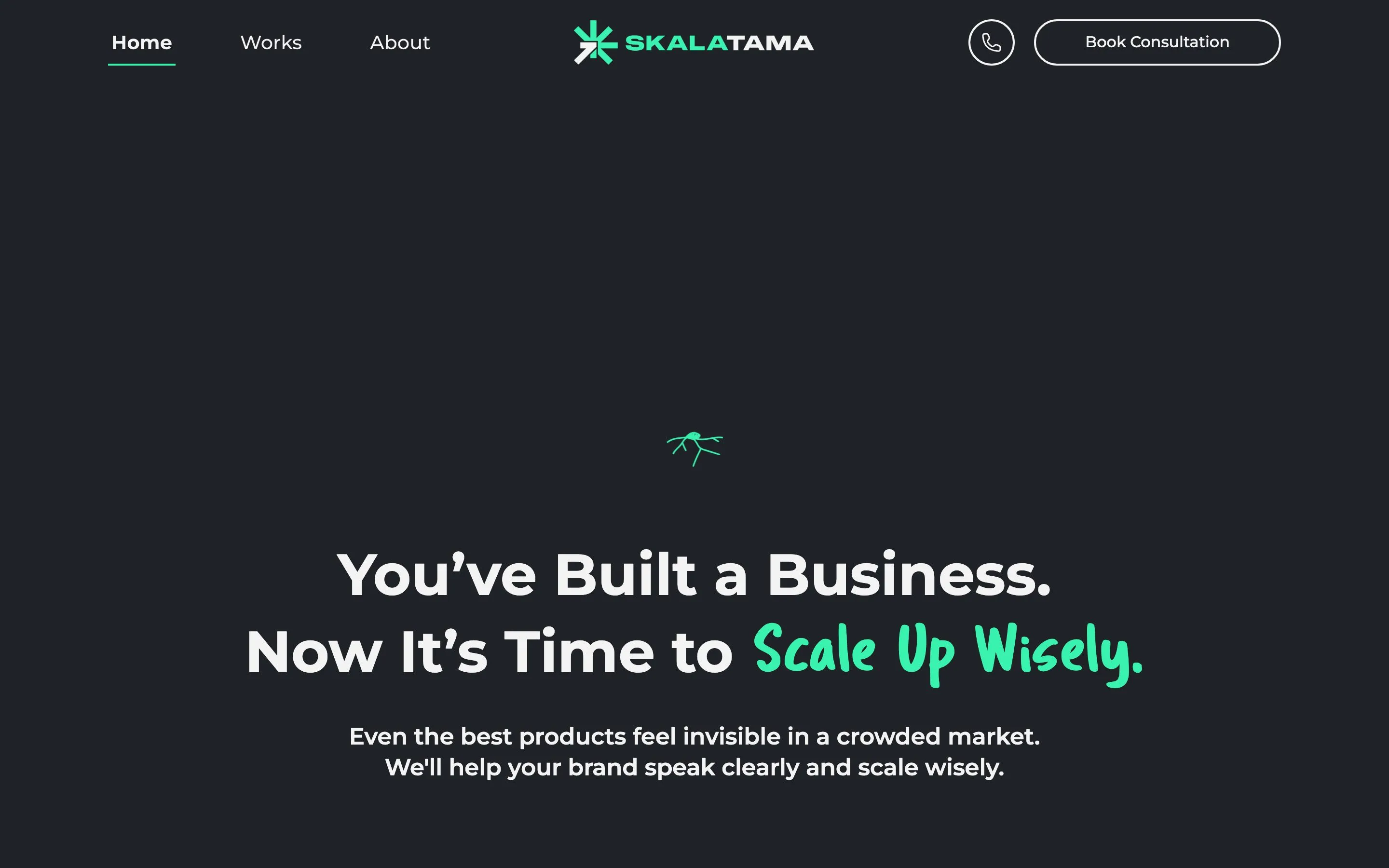
A branding consultant's own site: three pages up front, 23 client projects underneath, and a scroll experience that holds up on a phone.
- Website
- Frontend
skalatama.com
- Client
- Skalatama
- Role
- Development
- Collaboration
- With the Skalatama team
- Status
- Live
The problem
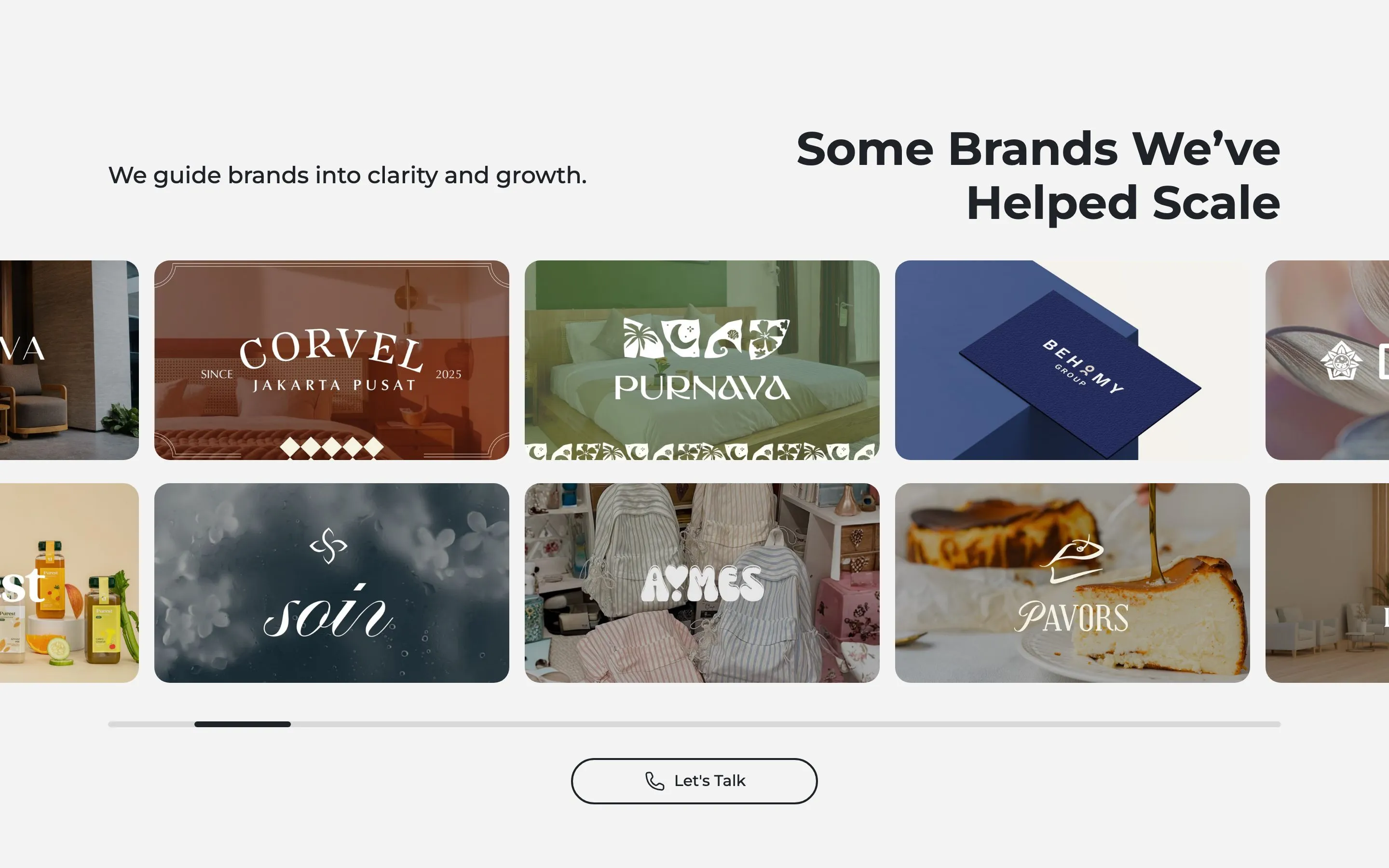
A consultancy that sells clarity has to survive its own advice. Skalatama had proof — 23 client projects across F&B, interiors and furniture — but no structure that let a prospect read one of them in depth.
The site leans on scrolling animation to hold attention, which is also its risk: on a mid-range phone that is the first thing to stutter, and a stutter reads as an unfinished site to exactly the audience being sold to.
What I built
Three pages up front — home, works, about — with a case study underneath each client project, carrying the category, the work done and the result.
The animation was tuned for phones rather than assumed: scrolling stays smooth under a thumb, a transition keeps moving while a flick is already decaying, and the page still opens if an opening animation never finishes.
Photography is the bulk of the site, so images arrive softly blurred instead of as empty boxes, and the pages stay quick to open with twenty-odd projects behind them.
What shipped
Three pages, 23 case studies
One page per client project with its category and the work done, so a prospect can read the work at depth instead of scanning a logo strip.
Scroll-led storytelling
Sections that hold while the story catches up, on home, about and works.
Smooth on touch
The animation keeps its timing when the page is scrolled with a thumb, not just a mouse wheel.
Images that arrive softly
A blurred version of each photograph in place while the full one loads.
Consultation enquiries
Every call to action opens a WhatsApp conversation rather than a form.
Every page describes itself
Each of the 26 pages carries its own headline and summary, so a search or a share never lands on a generic page.
Outcome
- A prospect can read a full case study instead of a logo strip.
- The site's own animation no longer stalls on a phone.
- Pages open quickly with twenty-odd client projects of photography behind them.
Screens
2 views